Evolution of the Necklace: Why Is There So Much Blackened Jewelry?
Last month I attended the opening preview for the Wayne Art Center’s prestigious Craft Forms, an international juried exhibition of contemporary craft, located on Philadelphia’s Main Line suburbs. As one of the artists selected for this stellar exhibit, I feel extremely fortunate to show one-of-a-kind jewelry in the midst of “this multi-generational conversation” of artists, borrowing this astute comment from juror Bruce W. Pepich’s catalog essay. Pepich, who is Executive Director and Curator of Collections at the Racine Art Museum, along with co-juror David R. McFadden, the Chief Curator Emeritus at the Museum of Arts and Design, New York, selected 99 pieces from 718 submissions in all fine craft media: clay, fiber, glass, metal, wood, mixed-media and 3-D printing.
Walking through this exhibition, I reacted to seeing jewelers’ pieces that seem to capitalize on the age-old attraction of the color black. This reaction is not meant to be an approval of the “blackened” process nor is it meant to be a critique. One may recall the now-iconic exhibit that took place at San Francisco’s Velvet Da Vinci Gallery in early 2013, “Monochrome Noir“, curated by studio jewelers/artists Tara Locklear and Michael Dale Bernard. I realized that this may be the moment to address and ask the question, “Just why is there so much blackened jewelry being created and shown?”
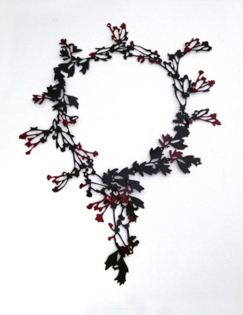
Helen Shirk, “Neckpiece NP2”, mild steel, china paint, 14in. x 11in. x 1in., 2013.California-based jeweler and educator Helen Shirk’s magnificently stark and elegant piece, “Neckpiece NP2” is placed on its own pedestal, adjacent to my neckpiece, “Widget Locket #5: Homage to Vanity”. Shirk uses delicate pierced-out forms of organic floral motifs but in a metal often not associated with delicacy: mild steel. This metal is painstakingly soldered together into a wildly circular wave pattern of out-flowing leaves that are patinated black. However, there are deep red accents of china paint applied in a deliberate fashion – despite its random-appearing highlights that try to take attention away from the fact that this blackened steel is not a material normally associated with delicate floral motifs. Shirk takes this “blackened steel” to a level of beauty that other steel jewelry tends to industrialize.
Patricia Sullivan: “Widget Locket #5: Homage to Vanity” (inside detail). Chased sterling silver, archival paper, Plexiglas, handmade sterling chain/clasp. 19 7/8″ x 2 5/16″ x 5/16″, 2014. Photo: P. SullivanMy own piece from this exhibition, “Widget Locket #5: Homage to Vanity“, was placed adjacent to Helen Shirk’s piece but created such an incredible dialogue that I was indulged to hear by several of the attendees at the opening. As a maker, I’m plagued continually by the times I chose to create a jewelry piece that did not partake in this “black patina” fascination that my peers are promulgating. I deliberately chose to keep a matte brushed silver coloring to this locket with a highly-polished handmade chain. My metalwork aspires to take aspects of its historical reference to Victorian mourning jewelry and develop a dialogue with the modern-day advent of digital photography and text-based art without losing context of the historical “gems” of jewelry work that my pieces reference. As an aside, I do employ the oxidation process in my work and have done so for several of my “Widget Lockets”. However, I do feel it’s due to being influenced by what I see my fellow makers in contemporary jewelry creating.
Teresa Faris, “Collaboration with a Bird IV, #1”, sterling silver, wood altered by a bird, 15in. X 4in. X 1in., 2014.Wisconsin artist and educator Teresa Faris creates neckpieces that have roots in organic interests, such as her “Collaboration with a Bird IV: #1.” However, in a similar fashion to Shirk’s piece, there’s an oxidized metal component, in this case, a black patina that is applied to the sterling silver partitions and square chain links. This piece was one I sought out immediately at the opening, as I was beyond curious to see how Faris incorporates what she describes as “wood altered by a bird.” What draws one into this piece is how much Faris is making a new genre of necklace, as I’m quite certain not one jeweler can claim seeing wooden elements that have been gnawed and “sculpted” by a bird in any well-known jeweler’s work before. In her artist statement, Faris introduces her work by describing how humans inhale and exhale over 22,000 times per day. This rhythm is so profound in her pieces, as each metal “sliver” of oxidized silver is created in such a consistent uniformity that one could almost hear a musical “metronome” in one’s head, while observing Faris’ beautiful grasp on consistency.
Wu Ching-Chih, “Love Is Blind”, copper, enamel/plique-a-jour, patina, 30x50x50cm, 2013.Taiwan artist Wu Ching-Chih’s “Love Is Blind” is a sculptural piece that surrounds the head but rests upon the wearer’s shoulders. While it is more viewed as a jewelry piece, it crosses the divide between a wearable neckpiece vs. a wearable sculpture. Wu Ching-Chih uses plique-a-jour enameling (a technique where the enamel is fired onto mainly copper then the “backing” of metal is etched away to reveal a stained glass-esque appearance of enamel-only.) Again, the use of oxidized darkened metal is what the artist chose as the branches of organic tree forms that hold these delicately enameled leaf forms. The curvaceous and hollow darkened copper pieces are made through forming; often Wu uses the repoussé metalwork technique to create these sinews and branch shapes that ultimately hold the light enameled pieces that rupture the blackened copper branches with glistening “lights” of colorful enameled accents.
Patricia Sullivan is a metalsmith and studio artist – living in the suburbs of Philadelphia across the great Delaware River in Southern New Jersey for the past 17 years. She spent seven years prior, living in both New York City and the Hudson Valley, New York, studying at Parsons School of Design, moving onward to receive a second degree (post-graduate) in Fine Arts/Metals at SUNY New Paltz. A Philadelphia native, Patricia was exposed to the arts and music of this region since a young age, receiving her first Bachelor's degree at Temple University in Philadelphia before her sojourn to New York began. Patricia has exhibited her artwork nationally. Recently, Ms. Sullivan was one of only thirty-four artists worldwide to exhibit her work at the Center for Craft, as part of being selected for Metalsmith magazine's prestigious annual "Exhibition in Print - Moved by Metal."
26 replies on “Evolution of the Necklace: Why Is There So Much Blackened Jewelry?”
An interesting idea, the “multi-generational conversation” in relation to jewellery. All those statements and stories interacting! Is the blackening still a nod to the Goth style? It seems a denial of the precious metal, finely finished aesthetic which characterises your work and so much of what we have regarded as treasures over the ages. Collaboration with a bird is amusing as a title and a curiosity. Another slant on inbuilt flaws in precious handmade items? If that had happened to some delicate wood I was planning to use I would have jettisoned it. Those disasters always happened at midnight before assignments were due. Congratulations on your selection Patricia! How wonderful for all of us to be part of the conversations.
Philippa, once again, you’ve introduced new viewpoints and dead-on target commentary re: this “blackened” fascination that seems to have pervaded jewelry makers through the ages. Yes, it is a nod to the Goth style!! But as new concepts and materials are introduced to this field, the whole oxidized black jewelry fascination seems to pick right up, just where it left off. In addition, I’m utterly floored by your notion that Faris’ “Collaboration with a Bird IV” is actually in fact a re-interpretation of how much we ascribe preciousness to any handmade item, essentially. It’s an interpretation of this piece that did not dawn on me at all, ’til I read your comments. Thank you so much, Philippa, for sharing such insights w/ me here today, and for your visit!
My dear ‘artdoesmatter’ (and I couldn’t agree more!!!).
I am so pleased that I have found you in the blogosphere. I was fortunate enough to acquire a beautiful bangle designed by Mandy Flood for Christmas (j’adore)….and somehow I found your blog via Mandy’s site.
Enjoyed reading your very individual view above…so good to hear an original voice among all the sameness that appears to permeate most of the tribes.
I have quite a few pieces of blackened mourning jewellery (designed by Julie de Ville)…and love wearing them. Do you think the ‘blackened’ style also borrows on the ‘imperfect perfection’ aesthetic…which I like very much. Your precious widget lockets are extremely beautiful too. You’ve got me hooked!
And do you know of Warwick Freeman’s jewellery….a gorgeous jeweller from New Zealand. I’m planning on going to his exhibition in August…and maybe enjoy a little splurge!!
If you have time, I would love you to visit my 2 blogs….Paris Rendezvous and Beyond…and my Art blog. Do take a squizz sometime.
Robyn, so happy to meet you and thank you so much for your wonderful comments and for the follow! I’ve just added myself as a follower to your blog through my Blogger acct. Yes – I do believe that this predominance of blackened jewelry does follow the ‘imperfect perfection’ aesthetic. However, I do think we contemporary jewelers, including myself, rely heavily on this ideal without exploring more ‘haunting’ or equally mysterious options, such as the color black so easily provides. Thank you for your fab compliments on my Widget Lockets. And I do really like the work of Warwick Freeman; how lucky you are to be planning a visit to his upcoming show. I’m envious! I genuinely appreciate your spirited commentary and visit today!!
Patricia, you have introduced me to a new world here. So interesting to read about the discussions in your sphere. As a painter, obviously I can only see things from my perspective, and to me, your piece is far better than the others here. Your work is strong, simple (extremely difficult to achieve), and transcends. I really think the others, while interesting, are a bit fussy. Congratulations on being accepted into this prestigious show and creating this breathtaking piece. Best, Anita
Anita, I can’t tell you how much I appreciate feedback like you’ve been sharing w/ me over the years. Next week marks my third anniversary of blogging here on WordPress/artdoesmatter. I wish every artist that I’ve met (through either social media like FB or blogging) had the same sensitivity as you to embrace artworks of all different forms. I feel when speaking w/ you – you understand jewelry as well as painting, clay as well as photography, or travel as much as creative writing!! No wonder your recent paintings have reached an even higher level of “outstanding”. Thanks so much for stopping in and sharing so much timely and relevant comments!!
Hey Patricia, happy 3rd anniversary and I hope many more! You and I started roughly the same time (I’m a few months later). We have become friends here and I want to thank you also for your friendly and insightful comments to me these years. I look forward to seeing more of your exceptional work!
Great question, Patricia! I sometimes use oxidised silver in my work, as well, as I like how it accentuates textures and surface ornamentation. But this is something else. There is real starkness here for sure. Could it be a comment on our turbulent times? I agree with Philippa that it is “denying the preciousness of silver”. There is a sort of “in your face” feel to it. And as well, flat black patina or thick powder coating accentuate lines and shapes; it’s much more graphic.
For your locket, you’ve chosen a beautiful brushed matte finish. It shows off every detail and nuance of your design, and the intricacies of your craftsmanship; I can almost feel the surface of the metal. “Truth to material” at its best!
Thank you for starting this conversation. As artists and makers, we need to be engaged in the world, be aware of the issues and contemporary practices in our field (and that’s not always easy). Your post is articulate, engaging and illuminating and helps makes sense of all that. I look forward to reading the next installment!
Dominique, you always provide such new insights to my posts on both ideas and processes in our field that I just didn’t realize until I read your commentary. I agree that this is a conversation in our field that needs to be discussed further. While the pieces I presented here are conceived mainly in oxidized metals, just as you’ve pointed out, powder coating and even 3-D printing pieces are choosing to employ this “stark black” – as you so wonderfully described above. While I would always be ‘that one student’ back in my university days that would not rush to the liver of sulphur patina jar, I do find that nowadays I’m much more drawn to this blackened finish. It very well could be due to our turbulent times, as so much is happening even worldwide in the past month. I’m curious to ask, are your current students rushing to the black patina jar/mixes like my crop of peers are doing?? I had a fabulous metals professor that would say, “What’s WRONG w/ polishing your pieces?” as polished, burnished work often was criticized heavier in student peer critiques. Soo much food for thought!!! TY for stopping by today, Dominique – I feel this post may need a “Part II” in the future.
Yes, quite a few are rushing to the patina jar…and my colleagues and myself are trying to curb their enthusiasm! But, to be fair, they understand more and more that, at this stage of their apprenticeship, it should not be used to hide, but to enhance.
Thank you Patricia!
Oh I love the piece by Helen Shirk so much. That piece just draws one in. It must have been so interesting in ‘the steel”. I enjoyed reading Teresa Faris’s artist statement very much and it made me look at the creative process in yet another light. Always delightful to see your work and as for the “Love is blind” piece. Just beautiful. The enamel process on jewellery is a favorite of mine to look at both now and from previous times in history. ❤
Sharon!!! So great to hear from you. Yes, Helen Shirk’s neckpiece was absolutely gorgeous. I feel the exhibit designers at Wayne Art Center reallllllllly knew what they were doing when they placed such opposite genres of metalsmithing side-by-side, such as Shirk vs. Sullivan (but ea. on its own pedestal), if I may flatter myself for one sec! And I just knew you’d be intrigued by Teresa Faris’ work and artist statement, since she does use unconventional materials sometimes but integrates them so gracefully into her jewelry. Wu, Ching-Chih’s piece was even more stunning in-person, as the little imprints or transparent windows of colored enamel he uses really breaks up the oxidized copper of the branches. Yes, enameling DOES have a serious history. So happy that as a fiber artist you’re already “in-the-know” about this. Thanks Sharon for both your fab visit and lovely remarks on my post about this exhibit!!
I have noticed the blackened jewelry. I thought it was because of economics, not so much silver, not so much gold. But this is in the commercial realm. From a fine arts standpoint, I don’t know. Goth may be the answer, as someone said. Or bleak times. There is hardly anything to celebrate out there. Possibly we as artists want to return to the Victorian era. As a place where everything turned out well after all.
Hollis, you bring up so many points here, but I will comment that I do think you hit the nail right on its head when you say “There is hardly anything to celebrate out there” in our world. Just in what, one month’s time, we’ve witnessed both the Sydney siege in Australia and the Paris bombings. Let’s not also forget the Boston Marathon bombings on our own soil. While darkening our metal or 3-D printing it black in color, are we artists cognizant of this happening, or is it just a nod to historical styles of jewelry (AND painting) as well. Did you at some point in your collage work, “Pieces of My Heart”, happen to use a monochromatic or darker palette of items?
Thank you Hollis so very much for visiting today and sharing such insightful (and pretty true!) comments w/ us.
No not a darker palette so far, but as I prepare for my new work, I am aware that there is a hooking up to the collective unconscious out there! I have always been attracted to natural disasters on an aesthetic level, and this new body of work will be no exception. Perhaps more obvious though. The trouble with paintings like that, is, the galleries and the collectors have trouble with the theme! I do use hugely bright colors though….We’ll see what this new stuff brings.
The Shirk piece is very striking and yours is fantastic. I would love to hear more of the dialogue you overheard about it…so interesting to combine several time periods in your one locket so I’m sure some of the dialogue addressed that as well as the whole “selfie” phenomenon.. I would hesitate to ruin the beauty of silver or other metals with oxidation. I have a couple pieces of black jewelry, not overly fond of them…
Thank you, Candace. It was good practice for me to stand next to my work and have to talk “off the cuff” to other artists (who were co-exhibitors) about the history of mourning jewelry, the chasing/repousse technique, and the meaning behind choosing “a selfie” for the inside of the locket. I emphasized how I’m satirizing and don’t actually take “selfies” very often. What an interesting perspective you’ve shared here about oxidizing jewelry. As I said above, I’m doing this more and more in my own work, and I’m not really sure why other than seeing so much of it around me. Thanks so much for dropping by and commenting! I really value it.
I find your widget locket simply exquisite, especially when contrasted against the more contemporary black patina pieces. But then again, I’m partial to lockets and pocket watches. Best regards. PM
Thanks, Poetic, for your kind compliments for my Widget Locket. I find I’m always attracted to the historic, whether it’s through looking at jewelry, or even what books I choose to read. Thanks for dropping by artdoesmatter and sharing your lovely feedback!
Gina, you are such a doll for going that extra mile to go see my work, in-person, then taking such a lovely photo and sharing it w/ me!! I really appreciate that, more than you know. Thanks so much, and I want you to know I’ve been enjoying your blog and its accompanying stunning photographs, equally!!
It’s great to see art being contextualised in culture not just the art world. I wonder whether black, like Goth, is a way to come to terms with female strength and darkness? A way to try and integrate a suggestion of these into a ‘normal’ aesthetic, rather than the very ‘in your face’ Goth style?
“Look, I can be acceptable and pretty without being cookie-cutter pink-and-diamonds” – I exaggerate for effect!
Carys, what a fantastic point that no one else had addressed above nor I; quite possibly YES!! Yes, that the mode of creating this black-patinated jewelry is just another way to show feminine strength. Why should we feel compelled to dress in the now-popular pink powder-coated jewelry colors when we as females can assert a darker, more dramatic color in black (and just as you stated – not necessarily as aggressive and outward as the ‘goth’ way.)
Your comments and feedback are so welcomed here. I’m thrilled to have you share your thoughtful commentary with me!
Nice to visit again and find that you have reached an audience through your blog. To be honest, I did not read every comment, however, I wonder if the “black” trend in jewelry might in part result from the oxidation of silver? That black patina could be a traditional nod referenced earlier in the “multi-generational” comment.
Most definitely, Al! I do agree that the blackened patina so wildly popular in today’s jewelry is in fact a nod to earlier traditions of metalsmiths. Thanks so much for your visit and sharing your comments with me.


An interesting idea, the “multi-generational conversation” in relation to jewellery. All those statements and stories interacting! Is the blackening still a nod to the Goth style? It seems a denial of the precious metal, finely finished aesthetic which characterises your work and so much of what we have regarded as treasures over the ages. Collaboration with a bird is amusing as a title and a curiosity. Another slant on inbuilt flaws in precious handmade items? If that had happened to some delicate wood I was planning to use I would have jettisoned it. Those disasters always happened at midnight before assignments were due. Congratulations on your selection Patricia! How wonderful for all of us to be part of the conversations.
LikeLiked by 1 person
Philippa, once again, you’ve introduced new viewpoints and dead-on target commentary re: this “blackened” fascination that seems to have pervaded jewelry makers through the ages. Yes, it is a nod to the Goth style!! But as new concepts and materials are introduced to this field, the whole oxidized black jewelry fascination seems to pick right up, just where it left off. In addition, I’m utterly floored by your notion that Faris’ “Collaboration with a Bird IV” is actually in fact a re-interpretation of how much we ascribe preciousness to any handmade item, essentially. It’s an interpretation of this piece that did not dawn on me at all, ’til I read your comments. Thank you so much, Philippa, for sharing such insights w/ me here today, and for your visit!
LikeLiked by 1 person
My dear ‘artdoesmatter’ (and I couldn’t agree more!!!).
I am so pleased that I have found you in the blogosphere. I was fortunate enough to acquire a beautiful bangle designed by Mandy Flood for Christmas (j’adore)….and somehow I found your blog via Mandy’s site.
Enjoyed reading your very individual view above…so good to hear an original voice among all the sameness that appears to permeate most of the tribes.
I have quite a few pieces of blackened mourning jewellery (designed by Julie de Ville)…and love wearing them. Do you think the ‘blackened’ style also borrows on the ‘imperfect perfection’ aesthetic…which I like very much. Your precious widget lockets are extremely beautiful too. You’ve got me hooked!
And do you know of Warwick Freeman’s jewellery….a gorgeous jeweller from New Zealand. I’m planning on going to his exhibition in August…and maybe enjoy a little splurge!!
If you have time, I would love you to visit my 2 blogs….Paris Rendezvous and Beyond…and my Art blog. Do take a squizz sometime.
Ciao
Robyn
LikeLike
Robyn, so happy to meet you and thank you so much for your wonderful comments and for the follow! I’ve just added myself as a follower to your blog through my Blogger acct. Yes – I do believe that this predominance of blackened jewelry does follow the ‘imperfect perfection’ aesthetic. However, I do think we contemporary jewelers, including myself, rely heavily on this ideal without exploring more ‘haunting’ or equally mysterious options, such as the color black so easily provides. Thank you for your fab compliments on my Widget Lockets. And I do really like the work of Warwick Freeman; how lucky you are to be planning a visit to his upcoming show. I’m envious! I genuinely appreciate your spirited commentary and visit today!!
LikeLike
Patricia, you have introduced me to a new world here. So interesting to read about the discussions in your sphere. As a painter, obviously I can only see things from my perspective, and to me, your piece is far better than the others here. Your work is strong, simple (extremely difficult to achieve), and transcends. I really think the others, while interesting, are a bit fussy. Congratulations on being accepted into this prestigious show and creating this breathtaking piece. Best, Anita
LikeLiked by 1 person
Anita, I can’t tell you how much I appreciate feedback like you’ve been sharing w/ me over the years. Next week marks my third anniversary of blogging here on WordPress/artdoesmatter. I wish every artist that I’ve met (through either social media like FB or blogging) had the same sensitivity as you to embrace artworks of all different forms. I feel when speaking w/ you – you understand jewelry as well as painting, clay as well as photography, or travel as much as creative writing!! No wonder your recent paintings have reached an even higher level of “outstanding”. Thanks so much for stopping in and sharing so much timely and relevant comments!!
LikeLike
Hey Patricia, happy 3rd anniversary and I hope many more! You and I started roughly the same time (I’m a few months later). We have become friends here and I want to thank you also for your friendly and insightful comments to me these years. I look forward to seeing more of your exceptional work!
LikeLiked by 1 person
Thanks Anita!! My admiration for your magnificent paintings (AND blog) is mutual!
LikeLike
Great question, Patricia! I sometimes use oxidised silver in my work, as well, as I like how it accentuates textures and surface ornamentation. But this is something else. There is real starkness here for sure. Could it be a comment on our turbulent times? I agree with Philippa that it is “denying the preciousness of silver”. There is a sort of “in your face” feel to it. And as well, flat black patina or thick powder coating accentuate lines and shapes; it’s much more graphic.
For your locket, you’ve chosen a beautiful brushed matte finish. It shows off every detail and nuance of your design, and the intricacies of your craftsmanship; I can almost feel the surface of the metal. “Truth to material” at its best!
Thank you for starting this conversation. As artists and makers, we need to be engaged in the world, be aware of the issues and contemporary practices in our field (and that’s not always easy). Your post is articulate, engaging and illuminating and helps makes sense of all that. I look forward to reading the next installment!
LikeLiked by 1 person
Dominique, you always provide such new insights to my posts on both ideas and processes in our field that I just didn’t realize until I read your commentary. I agree that this is a conversation in our field that needs to be discussed further. While the pieces I presented here are conceived mainly in oxidized metals, just as you’ve pointed out, powder coating and even 3-D printing pieces are choosing to employ this “stark black” – as you so wonderfully described above. While I would always be ‘that one student’ back in my university days that would not rush to the liver of sulphur patina jar, I do find that nowadays I’m much more drawn to this blackened finish. It very well could be due to our turbulent times, as so much is happening even worldwide in the past month. I’m curious to ask, are your current students rushing to the black patina jar/mixes like my crop of peers are doing?? I had a fabulous metals professor that would say, “What’s WRONG w/ polishing your pieces?” as polished, burnished work often was criticized heavier in student peer critiques. Soo much food for thought!!! TY for stopping by today, Dominique – I feel this post may need a “Part II” in the future.
LikeLike
Yes, quite a few are rushing to the patina jar…and my colleagues and myself are trying to curb their enthusiasm! But, to be fair, they understand more and more that, at this stage of their apprenticeship, it should not be used to hide, but to enhance.
Thank you Patricia!
LikeLiked by 1 person
Oh I love the piece by Helen Shirk so much. That piece just draws one in. It must have been so interesting in ‘the steel”. I enjoyed reading Teresa Faris’s artist statement very much and it made me look at the creative process in yet another light. Always delightful to see your work and as for the “Love is blind” piece. Just beautiful. The enamel process on jewellery is a favorite of mine to look at both now and from previous times in history. ❤
LikeLiked by 1 person
Sharon!!! So great to hear from you. Yes, Helen Shirk’s neckpiece was absolutely gorgeous. I feel the exhibit designers at Wayne Art Center reallllllllly knew what they were doing when they placed such opposite genres of metalsmithing side-by-side, such as Shirk vs. Sullivan (but ea. on its own pedestal), if I may flatter myself for one sec! And I just knew you’d be intrigued by Teresa Faris’ work and artist statement, since she does use unconventional materials sometimes but integrates them so gracefully into her jewelry. Wu, Ching-Chih’s piece was even more stunning in-person, as the little imprints or transparent windows of colored enamel he uses really breaks up the oxidized copper of the branches. Yes, enameling DOES have a serious history. So happy that as a fiber artist you’re already “in-the-know” about this. Thanks Sharon for both your fab visit and lovely remarks on my post about this exhibit!!
LikeLiked by 1 person
I have noticed the blackened jewelry. I thought it was because of economics, not so much silver, not so much gold. But this is in the commercial realm. From a fine arts standpoint, I don’t know. Goth may be the answer, as someone said. Or bleak times. There is hardly anything to celebrate out there. Possibly we as artists want to return to the Victorian era. As a place where everything turned out well after all.
LikeLiked by 1 person
Hollis, you bring up so many points here, but I will comment that I do think you hit the nail right on its head when you say “There is hardly anything to celebrate out there” in our world. Just in what, one month’s time, we’ve witnessed both the Sydney siege in Australia and the Paris bombings. Let’s not also forget the Boston Marathon bombings on our own soil. While darkening our metal or 3-D printing it black in color, are we artists cognizant of this happening, or is it just a nod to historical styles of jewelry (AND painting) as well. Did you at some point in your collage work, “Pieces of My Heart”, happen to use a monochromatic or darker palette of items?
Thank you Hollis so very much for visiting today and sharing such insightful (and pretty true!) comments w/ us.
LikeLiked by 1 person
No not a darker palette so far, but as I prepare for my new work, I am aware that there is a hooking up to the collective unconscious out there! I have always been attracted to natural disasters on an aesthetic level, and this new body of work will be no exception. Perhaps more obvious though. The trouble with paintings like that, is, the galleries and the collectors have trouble with the theme! I do use hugely bright colors though….We’ll see what this new stuff brings.
LikeLiked by 1 person
The Shirk piece is very striking and yours is fantastic. I would love to hear more of the dialogue you overheard about it…so interesting to combine several time periods in your one locket so I’m sure some of the dialogue addressed that as well as the whole “selfie” phenomenon.. I would hesitate to ruin the beauty of silver or other metals with oxidation. I have a couple pieces of black jewelry, not overly fond of them…
LikeLiked by 1 person
Thank you, Candace. It was good practice for me to stand next to my work and have to talk “off the cuff” to other artists (who were co-exhibitors) about the history of mourning jewelry, the chasing/repousse technique, and the meaning behind choosing “a selfie” for the inside of the locket. I emphasized how I’m satirizing and don’t actually take “selfies” very often. What an interesting perspective you’ve shared here about oxidizing jewelry. As I said above, I’m doing this more and more in my own work, and I’m not really sure why other than seeing so much of it around me. Thanks so much for dropping by and commenting! I really value it.
LikeLike
I find your widget locket simply exquisite, especially when contrasted against the more contemporary black patina pieces. But then again, I’m partial to lockets and pocket watches. Best regards. PM
LikeLike
Thanks, Poetic, for your kind compliments for my Widget Locket. I find I’m always attracted to the historic, whether it’s through looking at jewelry, or even what books I choose to read. Thanks for dropping by artdoesmatter and sharing your lovely feedback!
LikeLike
It was wonderful to finally view your art in person, Patricia! Your piece is exquisite.
I enjoyed reading this post and comment thread. You’ve generated quite an interesting discussion here!
LikeLike
Gina, you are such a doll for going that extra mile to go see my work, in-person, then taking such a lovely photo and sharing it w/ me!! I really appreciate that, more than you know. Thanks so much, and I want you to know I’ve been enjoying your blog and its accompanying stunning photographs, equally!!
LikeLike
It’s great to see art being contextualised in culture not just the art world. I wonder whether black, like Goth, is a way to come to terms with female strength and darkness? A way to try and integrate a suggestion of these into a ‘normal’ aesthetic, rather than the very ‘in your face’ Goth style?
“Look, I can be acceptable and pretty without being cookie-cutter pink-and-diamonds” – I exaggerate for effect!
LikeLike
Carys, what a fantastic point that no one else had addressed above nor I; quite possibly YES!! Yes, that the mode of creating this black-patinated jewelry is just another way to show feminine strength. Why should we feel compelled to dress in the now-popular pink powder-coated jewelry colors when we as females can assert a darker, more dramatic color in black (and just as you stated – not necessarily as aggressive and outward as the ‘goth’ way.)
Your comments and feedback are so welcomed here. I’m thrilled to have you share your thoughtful commentary with me!
LikeLiked by 1 person
Nice to visit again and find that you have reached an audience through your blog. To be honest, I did not read every comment, however, I wonder if the “black” trend in jewelry might in part result from the oxidation of silver? That black patina could be a traditional nod referenced earlier in the “multi-generational” comment.
LikeLiked by 1 person
Most definitely, Al! I do agree that the blackened patina so wildly popular in today’s jewelry is in fact a nod to earlier traditions of metalsmiths. Thanks so much for your visit and sharing your comments with me.
LikeLike